sponsored links


Saturday, February 28, 2009

Snowiest Winter Ever Recorded in North Dakota

A snowmobiler negotiates the streets of Crosby, North Dakota. Photograph courtesy of the Crosby Journal.

A snowmobiler negotiates the streets of Crosby, North Dakota. Photograph courtesy of the Crosby Journal.

Guest Post by Harold Ambler

Snow, wind, and cold have assaulted North Dakota yet again in the past 24 hours. In Bismarck Friday morning the temperature was 12 below zero with a new inch or two of snow expected following Thursday’s more significant storm.


According to USA Today, snow in the southern part of the state was bad enough Thursday that snowplow operators were pulling off the road, blinded by the whiteout conditions. A foot of snow was common in the heaviest band.


The National Weather Service predicts a high temperature of 3 degrees Fahrenheit Friday in Bismarck, as well as additional snow. As of Thursday, three-quarters of the state’s roads were still snow-covered, in whole or in part, from the storm that just ended the day before.

Howling winds and copious snow have combined to leave austere, menacing scenes like this in Cavalier County, North Dakota. Photograph by the ND Department of Emergency Services.

Howling winds and copious snow have combined to leave austere scenes like this in Cavalier County, North Dakota. Photograph courtesy of the ND Department of Emergency Services.

More than once during the winter, the Department of Transportation has issued a no-travel advisory, most recently on February 10.


Cecily Fong, spokeswoman for the state’s Department of Emergency Services, said that the winter got off to a bad start on November 4. “That first storm was definitely a blizzard with blowing and drifting snow,” she said. Since then, according to Fong, several counties have seen more than 400 percent of normal snowfall.


December was a record breaker for Bismarck, as it was at many other locations around the state. In Bismarck, the total for the month was 33.3 inches, the greatest amount ever received in a single month.


Those were early days, it turned out. Frequent storms, followed by howling northwest winds and record-breaking cold, have made it a winter to remember. On January 15, the morning low at the Bismarck airport was 44 below zero, the coldest ever for the date, and one degree shy of the all-time coldest reading for a state known to be less than balmy.


By the end of January, many counties had more than 400 percent of normal snow totals on the ground, and Governor John Hoeven had declared a state of emergency.


“There has been a repeated pattern,” said Fong, ”where the county will come and plow a road and then two days later, without any additional snow, the road becomes impassable again.” Relatively speaking, the people in Bismarck have gotten off light. Divide County, in the state’s northwest corner, has received 500 percent of normal snowfall.


Steve Andrist, who has lived most of his life in Divide county and is the publisher of the weekly Crosby Journal, commended the street department. “There has never been more than a day or a day and a half where the roads were

impassable,” he said.
Roads that were cleared once, and twice, have needed to be cleared a third time in various locations throughout the state. Photograph by the Department of Emergency Services.

Roads that were cleared once, and twice, have needed to be cleared a third time in various locations throughout the state. Photograph courtesy of the ND Department of Emergency Services.

After a lifetime living so near the Canadian border, did the last few months really amount to anything? “This winter got my attention,” he said. “The thing that’s different about this one is the volume of snow. It’s so much more than we anticipated. As far as snow and moving it, and moving it again, and having to move it again a third time, this has been very unusual.”


On February 19, the governor asked the federal government to provide emergency assistance for snow removal. “We’ve got roads that aren’t being plowed,” Fong said, “just because the funds aren’t available to do it.”


Although the spring melt is weeks away, Fong said that flooding is already a concern. “We don’t know where, and we don’t know when, but we’re keeping our eyes on it.”

George Will’s battle with hotheaded ice alarmists

http://farm3.static.flickr.com/2077/2073505689_2ae8c16643.jpg

Regular WUWT readers know of the issues related to Arctic Sea Ice that we have routinely followed here. The Arctic sea ice trend is regularly used as tool to hammer public opinion, often recklessly and without any merit to the claims. The most egregious of these claims was the April of 2008 pronouncement by National Snow and Ice Data Center scientist Dr. Mark Serreze of an ice free north pole in 2008. It got very wide press. It also never came true.


To my knowledge, no retractions were printed by news outlets that carried his sensationally erroneous claim.


A few months later in August, when it was clear his first prediction would not come true, and apparently having learned nothing from his first incident (except maybe that the mainstream press is amazingly gullible when it comes to science) Serreze made another outlandish statement of “Arctic ice is in its death spiral” and” The Arctic could be free of summer ice by 2030″. In my opinion, Serreze uttered perhaps the most irresponsible news statements about climate second only to Jim Hansen’s “death trains” fiasco. I hope somebody at NSIDC will have the good sense to reel in their loose cannon for the coming year.


Not to be outdone, in December Al Gore also got on the ice free bandwagon with his own zinger saying on video that the “entire north polar ice cap will be gone within 5 years“. There’s a countdown watch on that one.


So it was with a bit of surprise that we witnessed the wailing and gnashing of teeth from a number of bloggers and news outlets when in his February 15th column, George Will, citing a Daily Tech column by Mike Asher, repeated a comparison of 1979 sea ice levels to present day. He wrote:

As global levels of sea ice declined last year, many experts said this was evidence of man-made global warming. Since September, however, the increase in sea ice has been the fastest change, either up or down, since 1979, when satellite record-keeping began. According to the University of Illinois’ Arctic Climate Research Center, global sea ice levels now equal those of 1979.

The outrage was immediate and widespread. Media Matters: George Will spreads falsehoods Discover Magazine: George Will: Liberated From the Burden of Fact-Checking Climate Progress: Is George Will the most ignorant national columnist? One Blue Marble Blog: Double Dumb Ass Award: George Will George Monbiot in the Guardian: George Will’s climate howlers and Huffington Post: Will-fully wrong


They rushed to stamp out the threat with an “anything goes” publishing mentality. There was lots of piling on by secondary bloggers and pundits.

nsidc_extent_timeseries_021509

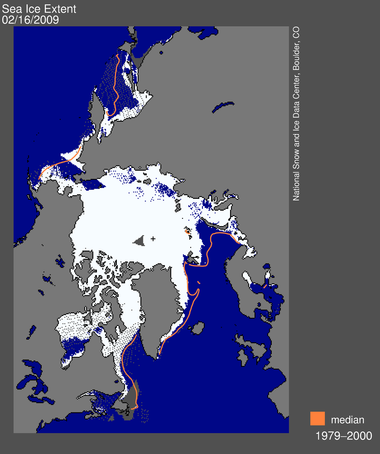
Feb 15th NSDIC Arctic Sea Ice Graph - click for larger image


Meanwhile, back at the ranch, I got interested in what was going on with odd downward jumps in the NSIDC Arctic sea ice graph, posting on Monday February 16th NSIDC makes a big sea ice extent jump - but why? Then when I was told in comments by NSIDC’s Walt Meier that the issue was “not worth blogging about” I countered with Errors in publicly presented data - Worth blogging about?


It soon became clear what had happened. There was a sensor failure, a big one, and both NSIDC and Cryosphere today missed it. The failure caused Arctic sea ice to be underestimated by 500,000 square kilometers by the time Will’s column was published. Ooops, that’s a Murphy Moment.


So it is with some pleasure that today I offer you George Will’s excellent rebuttal to the unapologetic trashing of his column . The question now is, will those same people take on Dr. Mark Serreze and Al Gore for their irresponsible proclamations this past year? Probably not. Will Serreze shoot his mouth off again this year when being asked by the press what the summer ice season will bring? Probably, but one can always hope he and others have learned something, anything, from this debacle.


Let us hope that cooler heads prevail.


Climate Science in A Tornado

By George F. Will, Washington Post
Friday, February 27, 2009; A17


Few phenomena generate as much heat as disputes about current orthodoxies concerning global warming. This column recently reported and commented on some developments pertinent to the debate about whether global warming is occurring and what can and should be done. That column, which expressed skepticism about some emphatic proclamations by the alarmed, took a stroll down memory lane, through the debris of 1970s predictions about the near certainty of calamitous global cooling.


Concerning those predictions, the New York Times was — as it is today in a contrary crusade — a megaphone for the alarmed, as when (May 21, 1975) it reported that “a major cooling of the climate” was “widely considered inevitable” because it was “well established” that the Northern Hemisphere’s climate “has been getting cooler since about 1950.” Now the Times, a trumpet that never sounds retreat in today’s war against warming, has afforded this column an opportunity to revisit another facet of this subject — meretricious journalism in the service of dubious certitudes.


On Wednesday, the Times carried a “news analysis” — a story in the paper’s news section, but one that was not just reporting news — accusing Al Gore and this columnist of inaccuracies. Gore can speak for himself. So can this columnist.


Reporter Andrew Revkin’s story was headlined: “In Debate on Climate Change, Exaggeration Is a Common Pitfall.” Regarding exaggeration, the Times knows whereof it speaks, especially when it revisits, if it ever does, its reporting on the global cooling scare of the 1970s, and its reporting and editorializing — sometimes a distinction without a difference — concerning today’s climate controversies.


Which returns us to Revkin. In a story ostensibly about journalism, he simply asserts — how does he know this? — that the last decade, which passed without warming, was just “a pause in warming.” His attempt to contact this writer was an e-mail sent at 5:47 p.m., a few hours before the Times began printing his story, which was not so time-sensitive — it concerned controversies already many days running — that it had to appear the next day. But Revkin reported that “experts said” this columnist’s intervention in the climate debate was “riddled with” inaccuracies. Revkin’s supposed experts might exist and might have expertise but they do not have names that Revkin wished to divulge.


As for the anonymous scientists’ unspecified claims about the column’s supposedly myriad inaccuracies: The column contained many factual assertions but only one has been challenged. The challenge is mistaken.


Citing data from the University of Illinois’ Arctic Climate Research Center, as interpreted on Jan. 1 by Daily Tech, a technology and science news blog, the column said that since September “the increase in sea ice has been the fastest change, either up or down, since 1979, when satellite record-keeping began.” According to the center, global sea ice levels at the end of 2008 were “near or slightly lower than” those of 1979. The center generally does not make its statistics available, but in a Jan. 12 statement the center confirmed that global sea ice levels were within a difference of less than 3 percent of the 1980 level.


So the column accurately reported what the center had reported. But on Feb. 15, the Sunday the column appeared, the center, then receiving many e-mail inquiries, issued a statement saying “we do not know where George Will is getting his information.” The answer was: From the center, via Daily Tech. Consult the center’s Web site where, on Jan. 12, the center posted the confirmation of the data that this column subsequently reported accurately.


The scientists at the Illinois center offer their statistics with responsible caveats germane to margins of error in measurements and precise seasonal comparisons of year-on-year estimates of global sea ice. Nowadays, however, scientists often find themselves enveloped in furies triggered by any expression of skepticism about the global warming consensus (which will prevail until a diametrically different consensus comes along; see the 1970s) in the media-environmental complex. Concerning which:


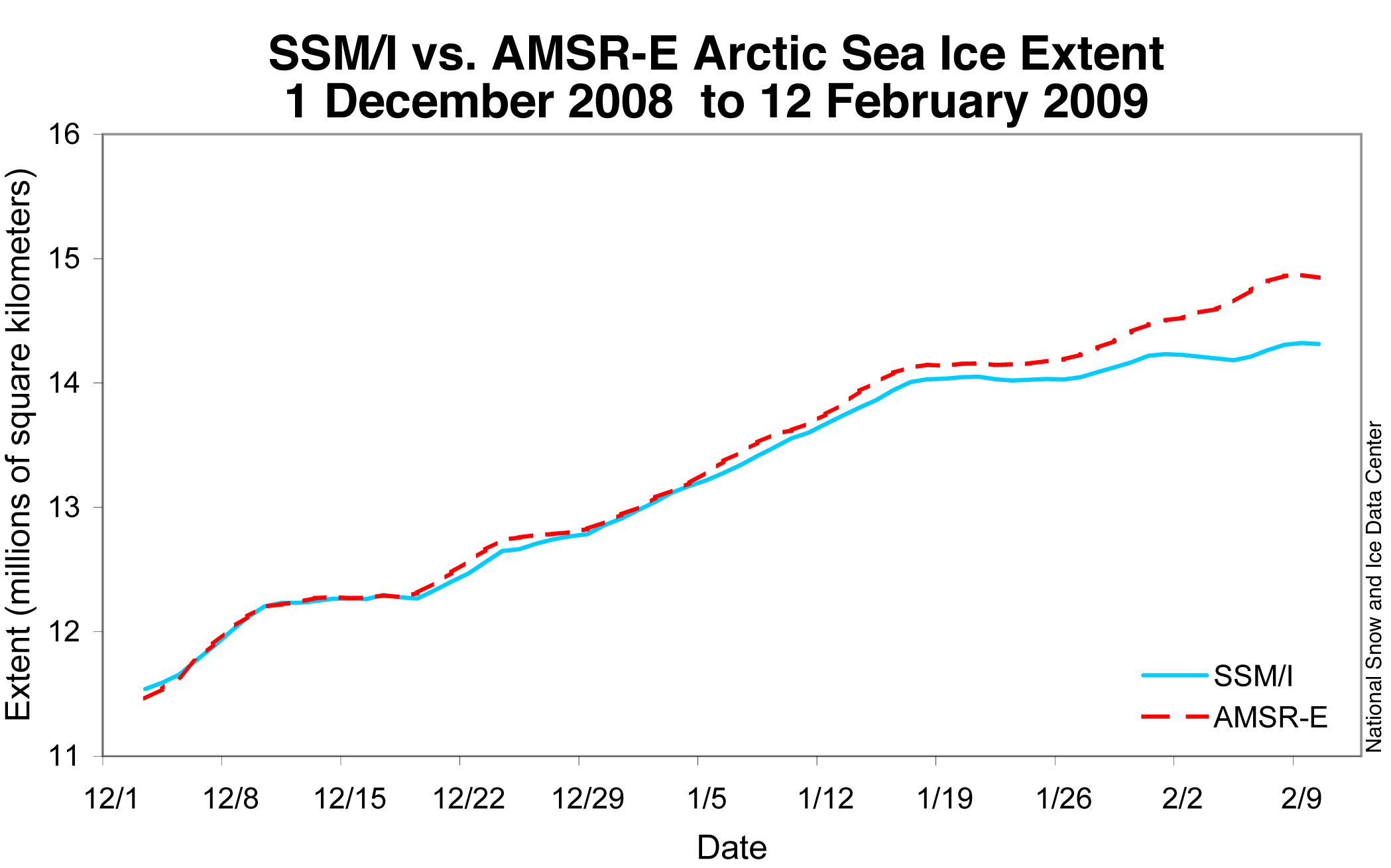
On Feb. 18 the U.S. National Snow and Ice Data Center reported that from early January until the middle of this month, a defective performance by satellite monitors that measure sea ice caused an underestimation of the extent of Arctic sea ice by 193,000 square miles, which is approximately the size of California. The Times (”All the news that’s fit to print”), which as of this writing had not printed that story, should unleash Revkin and his unnamed experts.

”Climate flicker” at the end of the last glacial period

From ETH in Zurich, this interesting essay on the last glacial period has some interesting points to ponder. h/t to Sid Stafford - Anthony


The last glacial period was characterised by strong climatic fluctuations. Scientists have now been able to prove very frequent and rapid climate change, particularly at the end of the Younger Dryas period, around 12,000 years ago. These fluctuations were accompanied by rapid changes in circulation in the oceans and the atmosphere.

Researchers are able to determine when glaciers were stable and when they melted by studying titanium content in glacial lake sediments. (Picture: siyublog/flickr)

Sediment deposits in lakes are the climate archives of the past. An international team of researchers from Norway, Switzerland and Germany have now examined sediments originating from the Younger Dryas period from the Kråkenes Lake in northwest Norway. In the sediments, they found clues that point to a “climate flicker” at the end of the last glacial period, oscillating between colder and warmer phases until the transition to the stable climate of the Holocene, our current interglacial period. The short-term, strong fluctuations of the Younger Dryas would have dwarfed the “extreme weather phenomena” seen today, according to Gerald Haug, professor at the Department for Earth Sciences at ETH Zürich and co-author of the study, which was published online yesterday in “Nature Geoscience”.


Seasonal sediment deposits

Seasonal sediment accumulation, for example, gave scientists clues to these strong climate fluctuations. They can be read in lakes in a similar way to reading rings on trees. In warmer phases and melting glaciers, the accumulation of sediments increases. More clues on the changes in glacier growth were given by the element titanium, which is present in the sediments. Glaciers erode their bedrock, and in doing so concentrate the titanium contained in the sediments they are carrying. The sediments containing titanium are washed into the glacier’s draining lakes in the meltwater. The amount of sediment and the titanium content can therefore allow us to deduce when the glaciers were stable and when they melted. The researchers interpreted the maxims, recurring every 10 years, as phases of strong glacier activity caused by temperature fluctuations and thus as warmer times.


A seemingly self-preserving cycle

The scientists also examined a sediment core from seabed deposits of the same age in the North Atlantic. They reconstructed the original temperature and salt concentration of the water based on microfossils and the oxygen isotope ratio in the sediment. It was shown that the results from the lake sediments corresponded to those from the sea sediments. “The melting of glaciers was caused by the warm Gulf stream advancing into this region,” Gerald Haug explains. This increase in temperature caused the west winds to shift to the north and brought warm air to northern Europe. However, the meltwater draining into the Atlantic lowered the salt concentration and the density of the surface water, changing the convection in the ocean, which in turn allowed new sea ice to form. Subsequently, the Gulf Stream and the west winds were again forced out of the North Atlantic area and the region cooled down once again. These processes were repeated for around 400 years, until the current interglacial period was able to stabilise itself.


The Würm glaciation began around 100,000 years ago and lasted until around 10,000 years ago. In this period, there were strong fluctuations between warm and cold phases, particularly in the North Atlantic area. The Younger Dryas, which ushered in the current interglacial period, is one of the best-known and best-researched abrupt climate changes of that glaciation. It began around 12,900 years ago and at first caused an abrupt temperature drop in the northern hemisphere, as well as a temperature rise of up to 10°C in less than 20 years towards the end, around 11,700 years ago.


Unclear mechanisms

Up until now, there have been several studies which document the glacial conditions during the Younger Dryas period of 1,200 years. However, the mechanisms which caused it, sustained it and finally led to an interglacial period have yet to be fully understood. The researchers believe that further high-resolution studies of this type could give insights into how glacial periods are triggered and how they are brought to an end.

Monday, February 23, 2009

Effect Global Warming in Montana

This blog is written by Mark Paquette......

While doing one of my favorite pastimes, browsing the internet (what did I used to do in my free time, oh ya, play basketball) I came across this article that describes temperature trends that a former climatologist and professor at Montana State University, Joseph Caprio, has seen over 54 years at Bozeman and Coldstream, Montana.


A couple of trends noticed by Mr. Caprio in this article are:


- He noted that warm extreme nighttime temperatures are occurring more often.


-The greatest warming observed has been in two time periods, from late February through March, and then again from late July to August.


-I don't think Mr. Caprio had direct input into this study, but scientists have observed that glaciers at Glacier National Park are disappearing, with 84% of the park's ice and snow fields gone. Some of these scientists believe that all glaciers in the park may be gone as soon as 2030.


This article brings up some interesting points. It made me wonder about how animal and plant life are dealing with these changes in the climate in the wonderful state of Montana. Do grizzly bears hibernate for a shorter time now? As Brett mentioned in a blog a week or so ago, bird species are beginning to be noticed in areas where "they shouldn't be". Are the same changes going to happen in Montana? Are they happening as we speak?


How will the disappearance or shrinkage of glaciers in this area of the country affect the people and the wildlife? Will rivers be different at all (will there water source(s) be changed)? How will tourism in the area be different? I mean if someone comes to see the glaciers, and all of a sudden they are not there, will they still come to visit the region? Basic questions, sure, but I believe they are valid ones.


Other questions that pop-up in my mind are why are nighttime temperatures affected more than any other time? Why are those two time periods, late winter and late summer, being altered more than any other time of the year?


Glacier National Park in Montana

Sunday, February 22, 2009

Sea Ice Sensor Degradation Hits Cryosphere Today

You may recall that I posted about how the National Snow and Ice Data Center has an issue with the DMSP satellite sensor channel used to detect sea ice. Cryosphere Today is a few days behind in update compared to NSIDC, and here is what their imagery now looks like before and after:

cryosphere2day_021909-022009-small

Above: Arctic “Insta-melt” Click for a larger image


Here is the link to reproduce the image above.


Larger “holes” are likely to open up in the arctic sea in the next couple of days as the sensor further degrades.


Here is what CT has to say as a caveat for the side by side images:

February 17, 2009 - The SSMI sensor seems to be acting up and dropping data swaths from time to time in recent days. Missing swaths will appear on these images as a missing data in the southern latitudes. If this persists for more than a few weeks, we will start to fill in these missing data swaths with the ice concentration from the previous day. Note - these missing swaths do not affect the timeseries or any other plots on the Cryosphere Today as they are comprised of moving averages of at least three days.

No mention of the issue on CT’s main page though. They are still commenting on George Will. They seem a bit out of touch on the sensor issue.


Possibly related posts: (automatically generated)

How not to measure temperature, part 83: No smoking please

The USHCN Climate station of record in Milton-Freewater, Oregon. Note the beige smoking stand.


The casual way that NOAA treats quality control of the measurement environment of the surface network has been evident for some time. The above photo is of course just one of many examples. Now before anyone jumps to a conclusion thinking that I’m suggesting heat from cigarettes might affect the temperature reading, let me be clear, I am not.


But a couple of guys hanging around the temperature sensor on a cold day shooting the bull and puffing, maybe. Body heat carried by wind to then nearby MMTS sensor “could” be an issue in making Tmax just a bit higher than it might normally be.


But that is likely swamped by the larger local signal near the temperature sensor -

Click for larger image

- the waste heat from the sewage treatment plant.

Friday, February 20, 2009

NSIDC: satellite sea ice sensor has “catastrophic failure” - data faulty for the last 45 or more days

http://gbailey.staff.shef.ac.uk/researchoverview_images/dmsp.jpg
The DMSP satellite is still operating, but the SSM/I sensor is not


Regular readers will recall that on Feb 16th I blogged about this graph of arctic sea ice posted on the National Snow and Ice Data Center sea ice news page. The downward jump in the blue line was abrupt and puzzling.

nsidc_extent_timeseries_021509

Click for larger image


Today NSIDC announced they had discovered the reason why. The sensor on the Defense Meteorological Satellite Program (DMSP) satellite they use had degraded and now apparently failed to the point of being unusable. Compounding the bad news they discovered it had been in slow decline for almost two months, which caused a bias in the arctic sea ice data that underestimated the total sea ice by 500,000 square kilometers. This will likely affect the January NSIDC sea ice totals.

Map of sea ice from space, showing sea ice, continents, ocean
Figure 1. High-resolution image Daily Arctic sea ice extent map for February 15, 2009, showed areas of open water which should have appeared as sea ice. Sea Ice Index data. About the data. Please note that our daily sea ice images, derived from microwave measurements, may show spurious pixels in areas where sea ice may not be present. These artifacts are generally caused by coastline effects, or less commonly by severe weather. Scientists use masks to minimize the number of “noise” pixels, based on long-term extent patterns. Noise is largely eliminated in the process of generating monthly averages, our standard measurement for analyzing interannual trends. Data derived from Sea Ice Index data set.
—Credit: National Snow and Ice Data Center
Graph with months on x axis and extent on y axis
Figure 2.
High-resolution image
Daily total Arctic sea ice extent between 1 December 2008 and 12 February 2009 for Special Sensor Microwave/Imager SSM/I compared to the similar NASA Earth Observing System Advanced Microwave Scanning Radiometer (EOS AMSR-E) sensor. —Credit: National Snow and Ice Data Center


Dr. Walt Meier of NSIDC had planned to do a guest post here on WUWT, but this evening, with the magnitude of the problem looming, he’s asked to defer that post until later. I certainly can’t fault him for that. He’s got his hands full. Hopefully they have a contingency plan in place for loss of the sensor/space platform. I applaud NSIDC for recognizing the problem and posting a complete and detailed summary today. I’ve resposted it below in its entirety. Note that this won’t affect other ice monitoring programs that use the Advanced Microwave Scanning Radiometer (EOS AMSR-E) sensor, which is on an entirely different platform, the AQUA satellite.


UPDATE: 2/19 Walt Meier writes with a clarification: “One detail, though perhaps an important [one]. I realize that it is bit confusing, but it is just one channel of the sensor that has issues. And it isn’t so much that it “failed”, but that quality degraded to the point the sea ice algorithm - the process to convert the raw data into sea ice concentration/extent - failed on Monday.” - Anthony


From NSIDC Sea Ice News:


As some of our readers have already noticed, there was a significant problem with the daily sea ice data images on February 16. The problem arose from a malfunction of the satellite sensor we use for our daily sea ice products. Upon further investigation, we discovered that starting around early January, an error known as sensor drift caused a slowly growing underestimation of Arctic sea ice extent. The underestimation reached approximately 500,000 square kilometers (193,000 square miles) by mid-February. Sensor drift, although infrequent, does occasionally occur and it is one of the things that we account for during quality control measures prior to archiving the data. See below for more details.


We have removed the most recent data and are investigating alternative data sources that will provide correct results. It is not clear when we will have data back online, but we are working to resolve the issue as quickly as possible.


Where does NSIDC get its data?


NSIDC gets sea ice information by applying algorithms to data from a series of Special Sensor Microwave/Imager (SSM/I) sensors on Defense Meteorological Satellite Program (DMSP) satellites. These satellites are operated by the U.S. Department of Defense. Their primary mission is support of U.S. military operations; the data weren’t originally intended for general science use.


The daily updates in Arctic Sea Ice News & Analysis rely on rapid acquisition and processing of the SSM/I data. Because the acquisition and processing are done in near-real time, we publish the daily data essentially as is. The data are then archived and later subjected to very strict quality control. We perform quality control measures in coordination with scientists at the NASA Goddard Space Flight Center, which can take up to a year. High-quality archives from SSM/I, combined with data from the earlier Scanning Multi-channel Microwave Radiometer (SMMR) data stream (1979–1987) provide a consistent record of sea ice conditions now spanning 30 years.


Data error sources
As discussed above, near-real-time products do not undergo the same level of quality control as the final archived products, which are used in scientific research published in peer-reviewed journals. However, the SSM/I sensors have proven themselves to be generally quite stable. Thus, it is reasonable to use the near-real-time products for displaying evolving ice conditions, with the caveat that errors may nevertheless occur. Sometimes errors are dramatic and obvious. Other errors, such as the recent sensor drift, may be subtler and not immediately apparent. We caution users of the near-real-time products that any conclusions from such data must be preliminary. We believe that the potential problems are outweighed by the scientific value of providing timely assessments of current Arctic sea ice conditions, as long as they are presented with appropriate caveats, which we try to do.


For several years, we used the SSM/I sensor on the DMSP F13 satellite. Last year, F13 started showing large amounts of missing data. The sensor was almost 13 years old, and no longer provided complete daily data to allow us to track total daily sea ice extent. As a result, we switched to the DMSP F15 sensor for our near-real-time analysis. For more information on the switch, see “Note on satellite update and intercalibration,” in our June 3, 2008 post.


On February 16, 2009, as emails came in from puzzled readers, it became clear that there was a significant problem—sea-ice-covered regions were showing up as open ocean. The problem stemmed from a failure of the sea ice algorithm caused by degradation of one of the DMSP F15 sensor channels. Upon further investigation, we found that data quality had begun to degrade over the month preceding the catastrophic failure. As a result, our processes underestimated total sea ice extent for the affected period. Based on comparisons with sea ice extent derived from the NASA Earth Observing System Advanced Microwave Scanning Radiometer (EOS AMSR-E) sensor, this underestimation grew from a negligible amount in early January to about 500,000 square kilometers (193,000 square miles) by mid-February (Figure 2). While dramatic, the underestimated values were not outside of expected variability until Monday, February 16. Although we believe that data prior to early January are reliable, we will conduct a full quality check in the coming days.


Sensor drift is a perfect but unfortunate example of the problems encountered in near-real-time analysis. We stress, however, that this error in no way changes the scientific conclusions about the long-term decline of Arctic sea ice, which is based on the the consistent, quality-controlled data archive discussed above.


We are actively investigating how to address the problem. Since we are not receiving good DMSP SSM/I data at the present time, we have temporarily discontinued daily updates. We will restart the data stream as soon as possible.


Some people might ask why we don’t simply switch to the EOS AMSR-E sensor. AMSR-E is a newer and more accurate passive microwave sensor. However, we do not use AMSR-E data in our analysis because it is not consistent with our historical data. Thus, while AMSR-E gives us greater accuracy and more confidence on current sea ice conditions, it actually provides less accuracy on the long-term changes over the past thirty years. There is a balance between being as accurate as possible at any given moment and being as consistent as possible through long time periods. Our main scientific focus is on the long-term changes in Arctic sea ice. With that in mind, we have chosen to continue using the SSM/I sensor, which provides the longest record of Arctic sea ice extent.


For more information on the NSIDC sea ice data, see the following resources on the NSIDC Web site:

Wednesday, February 18, 2009

Britain’s Lessons From The Winter of 2008-2009

Guest post by Steven Goddard

The UK has been experiencing the coldest winter in several decades, and hopefully policymakers have learned a few basic lessons from this. Here is my wish list, which seem painfully obvious.
  1. Britain can’t rely on global warming to stay warm in the winter.
  2. Britain can’t rely on solar power to stay warm in the winter. There just isn’t enough sun (which is why it is cold in the winter.)
  3. Britain can’t rely on wind power to stay warm in the winter. During the coldest weather the winds were calm (which is one reason why the air temperatures were so low.)
  4. Britain can’t rely on Russian natural gas to stay warm. The gas supply was cut off for weeks due to politics.
The only large scale energy supplies the UK can rely on in the near future are coal, oil and a small amount of nuclear. So next time you see a “coal train of life“ remember to wave at the driver. And I hate those ugly, motionless windmills popping up all over the countryside.

Tuesday, February 17, 2009

Using the Ocean to Sequester Crop Residue Carbon

This story caught my eye........

Researchers from the University of California and Washington propose that the only method that has a long term, efficient, practical and economic impact in removing carbon dioxide from the atmosphere is the removal and burial of crop residues in the deep ocean and preferably off the mouths of major rivers.


Why dump at the end of major rivers?


River’s-end dump sites already receive a fair amount of vegetable matter that flows down river. So any ecological effect would likely be minimized compared with other parts of the deep ocean, according to the Christian Science Monitor Blog.


According to the abstract and full study, which is posted in the Journal of Environmental Science and Technology, this process is 92% efficient in sequestration of crop residue, such as corn stalks, while cellulosic ethanol production is only 32% efficient.


The research team says that this process (burial of crop residues in the deep ocean) can potentially capture 15% of the current global carbon dioxide annual increase.


Robert Carney, a biological oceanographer from LSU offers some caution with the proposal by lead researchers Stuart Strand (University of Washington) and Gregory Benford (University of California) toward the bottom of the Christian Science Monitor blog page.

Hansen on “death trains” and coal and CO2

hansen_coal_death_train1

NASA’s Dr. James Hansen once again goes over the top. See his most recent article in the UK Guardian. Some excerpts:

“The trains carrying coal to power plants are death trains. Coal-fired power plants are factories of death.”

And this:

Clearly, if we burn all fossil fuels, we will destroy the planet we know. Carbon dioxide would increase to 500 ppm or more.

Only one problem there Jimbo, CO2 has been a lot higher in the past. Like 10 times higher.


From JS on June 21, 2005:

http://www.junkscience.com/images/paleocarbon.gif

One point apparently causing confusion among our readers is the relative abundance of CO2 in the atmosphere today as compared with Earth’s historical levels. Most people seem surprised when we say current levels are relatively low, at least from a long-term perspective - understandable considering the constant media/activist bleat about current levels being allegedly “catastrophically high.” Even more express surprise that Earth is currently suffering one of its chilliest episodes in about six hundred million (600,000,000) years.


Given that the late Ordovician suffered an ice age (with associated mass extinction) while atmospheric CO2 levels were more than 4,000ppm higher than those of today (yes, that’s a full order of magnitude higher), levels at which current ‘guesstimations’ of climate sensitivity to atmospheric CO2 suggest every last skerrick of ice should have been melted off the planet, we admit significant scepticism over simplistic claims of small increment in atmospheric CO2 equating to toasted planet. Granted, continental configuration now is nothing like it was then, Sol’s irradiance differs, as do orbits, obliquity, etc., etc. but there is no obvious correlation between atmospheric CO2 and planetary temperature over the last 600 million years, so why would such relatively tiny amounts suddenly become a critical factor now?


Adjacent graphic ‘Global Temperature and Atmospheric CO2 over Geologic Time’ from Climate and the Carboniferous Period (Monte Hieb, with paleomaps by Christopher R. Scotese). Why not drop by and have a look around?

Sunday, February 15, 2009

Climate Change in California

This blog is written by Mark Paquette.......


Much like the Bangladesh article I blogged about last week, this article discusses a similar subject matter (How will climate change affect this area?), only this time it is a little closer to home.


Newly-appointed Secretary of Energy Steven Chu, a Nobel Prize-winning physicist, is worried about the effects global warming may have on his home state of California. More specifically, he is worried about the water supply that keeps many Californian farms in business and lets them irrigate their crops during the dry season.


Obviously, the average American has more concerns about the water supply in this area than someplace overseas for several reasons:


1) California is in our country and we can follow the weather and climate in this area more closely than say.... Bangladesh. We can see when they are experiencing a drought and when they are not, and we also hear about concerns/problems with the water supply.


2) With a huge and growing population, changes in California's climate may affect us directly if we live there or have friends or family who live there. Or if we move there when we retire, or get a job and move to the area when we are younger.


3) As is mentioned in the article, California supplies more than half of America's fruits, vegetables and nuts. Any change in the water supply will obviously affect both the amount of these goods produced and the price we pay for these items at the neighborhood grocery store.


4) Because of California's unique climate, water is already a precious commodity. If water becomes even more scarce, what changes (climatologically, politically, and economically) may occur? We have heard the states of California, Nevada and Arizona bicker over the water in the Colorado River. Will this fighting become worse and more politically heated?


5) What happens to the businesses centered in California or nearby areas (movie/TV production in Hollywood, gambling in Las Vegas, tourism everywhere, skiing in the mountains) if the water supply becomes more limited?


For residents of places where the water supply is not nearly as big of a concern as it is in California, we assume there will always be water for whatever needs we have. Residents of the water-deprived areas of the western US know how precious the water supply is and know how a dry year or years can affect almost all aspects of life. Will California feel more of a pinch due to the limits of the water supply in the future?


Snow pack in a few areas of the Sierra Nevadas March 3, 2002

The BBC Attempts to Patch Up the Cracks - botches it, citing AGW could set off “negative feedback”

UPDATE: BBC Can’t even get their reporting correct. The reporter in this video report that accompanies the web article says that “The fear is that increased global warming could set off what’s called negative feedback…..” and that now we are in “scenarios unexplored by the models”. No kidding, it’s that bad. For those of you that don’t know, some alarmists claim that “negative climate feedback is as real as the Easter Bunny, which is what makes this BBC factual error so hilarious.


Readers please let the BBC know that they have no idea what they are talking about. - Anthony


for video click here,


Guest post by Steven Goddard

On Wednesday, normally stalwart UK global warming promoter - The Guardian, ran this remarkable headline, which was also covered here on WUWT:

‘Apocalyptic climate predictions’ mislead the public, say experts’

The Met Office Hadley Centre, one of the most prestigious research facilities in the world, says recent “apocalyptic predictions” about Arctic ice melt and soaring temperatures are as bad as claims that global warming does not exist. Such statements, however well-intentioned, distort the science and could undermine efforts to tackle carbon emissions, it says.

Undaunted and defiant, their comrades in global warming arms at the BBC, chose this as the lead story for Sunday morning:

Global warming ‘underestimated’

bbc_gw_underestimated

The severity of global warming over the next century will be much worse than previously believed, a leading climate scientist has warned.

….

“We are basically looking now at a future climate that is beyond anything that we’ve considered seriously in climate policy,” he said. Prof Field said the 2007 report, which predicted temperature rises between 1.1C and 6.4C over the next century, seriously underestimated the scale of the problem. “

File image of a polar bear in the Arctic

BBC employs the old standby icon - a polar bear

Prof Field said rising temperatures could thaw Arctic permafrost

One fatal flaw with the BBC story is that Chris Field is not a climate scientist, as they claimed. He is actually a Professor of Biology in an Ecology Department. So how does the BBC choose their headlines? In matters of global warming, apparently the apocalyptic words of one American ecologist overrule those of the UK’s own government climate scientists at The Met Office. Chris Field clearly does not have any credentials to be making the climate claims the BBC reported. This looks more and more like a Shakespearean comedy every day.For them all together; which maintained so politic a state of evil that they will not admit any good part to intermingle with them.William Shakespeare - from ‘Much Ado About Nothing’

Friday, February 13, 2009

Collapse of Ice Sheet would Shift the Rotation Axis of Earth

Geophysicists from the University of Toronto in Canada say that it is the coastlines of North America and the nations in the southern Indian Ocean in particular that face the greatest threats from sea level rises if there is a complete collapse of the West Antarctica Ice Sheet, according to their recent study.


The West Antarctic Ice Sheet.

If the West Antarctic Ice Sheet collapses, the rise in sea levels around many coastal regions will be as much as 25 per cent more than expected, for a total of between six and seven metres if the whole ice sheet melts,” says Jerry Mitrovica, a geophysicist.


Why is that?


1. If the West Antarctic Ice Sheet collapses, sea level will fall close to the Antarctic and will rise much more than the expected estimate in the northern hemisphere because when an ice sheet melts, its gravitational pull on the ocean is reduced and water moves away from it.


2. If the ice sheet collapses the depression (hole) in the Antarctic bedrock that sits under the ice sheet will fill with water. But, as the ice disappears, the hole will shrink as the region rebounds from the loss of ice, which will force some of the water out into the ocean.


3. The collapse of the ice sheet will cause the earth's rotation axis to shift 500 meters from its present condition, which will move water from the southern Atlantic and Pacific oceans northward toward North America and into the southern Indian Ocean.


There is still some question as to how much ice would actually disappear if the whole sheet collapses, but even still, the researchers state that the sea-level rise that would occur at many populated coastal sites would be much larger than one would estimate by simply distributing the meltwater evenly.


There is a link to an illustration of the process at the bottom of the University of Toronto press release.

Finally, a sunspot, but it is a Cycle 23 spot

Just when you think cycle 23 may be over, it pops out another spot. Here is the SOHO MDI image showing a sunspot dubbed #1012, in solar cycle 23.

mdi_spot1012

From SOHO


For those wondering how this is determined, cycle 24 spots (the new cycle) normally start near the poles and gradually migrate towards the equator as the cycle progresses over 11 years. So in this case, a spot at the equator means it is a cycle 23 spot. The magnetic polarity of the spot also defines it as a cycle 23 spot.


Here is a closer view:

mdi_1012_zoom1

Thursday, February 12, 2009

Global Warming Makes Allergies Worse

Global warming…I’m sure there are people out there who don’t want to hear one more thing about it! Right? Global warming is such a hot topic right now for politicians, environmentalists, and… allergy sufferers? That’s right. As the planet heats up, so does our battle against allergies and asthma. In fact, many scientists now acknowledge the link between global warming and breathing problems.


What does global warming have to do with allergies? As the planet heats up, winter seasons become shorter. That means longer stretches of warm weather – and allergies. Springtime has been arriving earlier, leading to months of misery for those with airborne allergies. How much earlier? 10-15 days earlier in the past three decades alone. And this trend is not expected to stop anytime soon. Thanks to the lengthening seasons, allergies aren’t just lasting longer; they’re becoming more severe as well. The problem is so serious that experts have been scrambling to create new policies and solutions. Even the World Health Organization has commented on the serious health implications of longer pollen seasons.


There is more carbon dioxide in the air during allergy season. This is detrimental to allergy sufferers because plants and weeds thrive when they’re exposed to more carbon dioxide. One sign of a strong plant is the amount of pollen it produces. And with pollen levels on the rise, people with allergies are noticing an increase in their symptoms.


If you’re a city dweller, you could have an even harder time. Cities act like giant greenhouses for weeds. The press of bodies and buildings trap heat, causing weeds to grow larger and release more pollen. The large number of people releasing carbon dioxide into city air also stimulates weed growth. Research has shown that city weeds can grow twice as large as their country cousins. To make matters worse, they also produce stronger pollen that wreaks havoc on allergies.


Global Warming Brings More Allergens


With longer occurrences of warm, wet weather – not to mention the increase in floods and storms – the air contains more mold and fungi than ever. This is bad news for allergy sufferers, since those are some of the most common allergens. Asthma is on the rise, too, especially among young children who live in the city.


Even in the dry seasons, dust, toxins and smog lurk in the air, making it harder to breathe. But global warming is such a big problem -what can allergy sufferers do to make living – and breathing – a bit easier?


Fortunately, there are plenty of options that don’t involve drug therapy (which can have unwanted side effects).


First, take care of your airways. Give yourself good air to breathe by investing in a HEPA filter. Clean all the air filters in your home. And don’t neglect your car’s air filter if you spend a substantial amount of time behind the wheel. Keep track of air quality alerts in your area; on days when allergens are high, stay indoors as much as possible and keep the windows closed. On hot days, carry out most of your physical activities in the morning before allergens have a chance to flourish in the midday heat.


Consume foods that help your airways function properly. This includes things rich in essential fatty acids, such as fish, seeds, and nuts. You can also take a good fish oil supplement.


Make your home as allergy free as possible. Carpets attract and trap dust, mites, and other allergens. Consider switching to hardwood flooring to improve your allergy symptoms. Regular cleaning of curtains, rugs and linens also helps to keep allergies at bay. And don’t forget about the health benefits of hypoallergenic trees and plants! Not only will they improve the air quality around your home, they’ll add beauty, too.


Not sure what you’re allergic to? Take a test! Check out: http://www.foodintolerancenews.com

Wednesday, February 11, 2009

Why Global Warming May Be Fueling Australia's Fires

Firefighters in the town of Labertouche, east of Melbourne, on Feb. 7, 2009

The raging infernos that have left more than 160 people dead in southern Australia burned with such speed that they resembled less a wildfire than a massive aerial bombing. Many victims caught in the blazes had no time to escape; their houses disintegrated around them, and they burned to death. As firefighters battle the flames and police begin to investigate possible cases of arson around some of the fires, there will surely be debates over the wisdom of Australia's standard policy of advising residents to either flee a fire early or stay in their homes and wait it out. John Brumby, the premier of the fire-hit Australian state of Victoria, told a local radio station on Monday that "people will want to review that ... There is no question that there were people who did everything right, put in place their fire plan, and it [didn't] matter — their house was just incinerated."

Although the wildfires caught so many victims by surprise last weekend, there has been no shortage of distant early-warning signs. The 11th chapter of the second working group of the 2007 Intergovernmental Panel on Climate Change, for example, warned that fires in Australia were "virtually certain to increase in intensity and frequency" because of steadily warming temperatures over the next several decades. Research published in 2007 by the Australian government's own Commonwealth Scientific and Industrial Research Organization reported that by 2020, there could be up to 65% more "extreme" fire-danger days compared with 1990, and that by 2050, under the most severe warming scenarios, there could be a 300% increase in such days. "[The fires] are a sobering reminder of the need for this nation and the whole world to act and put at a priority the need to tackle climate change," Australian Green Party leader Bob Brown told the Sky News. (See pictures of Australia's wildfires.)


Destructive wildfires are already common in Australia, and it's not hard to see why climate change would increase their frequency. The driest inhabited continent on the planet, Australia has warmed 0.9°C since 1950, and climate models predict the country could warm further by 2070, up to 5°C over 1990 temperatures, if global greenhouse-gas emissions go unchecked. Beyond a simple rise in average temperatures, climate change will also lead to an increase in Australia's extreme heat waves and droughts. Southwestern Australia is already in the grip of a prolonged drought that has decimated agriculture and led to widespread water rationing; the region is expected to see longer and more extreme dry periods in the future as a result of steady warming.


It's important to acknowledge that no single weather event can be definitively caused by climate change — and it's possible that the current inferno in Australia might have been as intense and deadly even without the warming of the past several decades. Police are beginning to suspect that many of the fires may have been deliberately set, and the sheer increase in the number of homes built in fire-danger zones in southern Australia today puts more people in harm's way, raising the potential death toll. Still, heat waves and drought set the table for wildfires, and temperatures in the worst-hit areas have been over 110°F (43°C) while humidity has bottomed out near zero. Climate change will continue to be a threat multiplier for forest fires. (See the top 10 green ideas of 2008.)


That's one more reason why the world must work together to reduce global carbon emissions to minimize the impact of climate change. The trouble is, though, CO2 cuts won't be enough. As a recent paper in the Proceedings of the National Academy of Science points out, even if we are successful in cutting carbon emissions rapidly — hardly an easy task — the momentum of climate change will continue for centuries. That means our ability to adapt to the impacts of warming, including more aggressive responses to wildfires like those in Australia, will become all the more critical, lest natural disasters turn into human catastrophes. But it also means that the world we've become accustomed to will change, perhaps irrevocably. The wildfires in southern Australia are already the worst in the nation's history — but they surely won't be the last.


See pictures of Australia's hidden islands.


See pictures of the world's most polluted places.

Many North American Birds Moving Northward

A report just released by the Audubon Society shows that a significant number of bird species seen in North America during the first weeks of winter have moved dramatically northward over the span of 40 years.


Also, a number of grassland species are not following this northward trend and for these species disappearing habitat from warming is taking an enormous toll, and leaving them with nowhere to go.


One of our biggest movers, the Purple Finch.

How did they determine this?


Tens of thousands of citizen scientists take part in the Audubon's annual Christmas bird count and report their findings to the society. Based on an analysis of 305 bird species across North America, the results indicate an average northward movement of 35 miles. Sixty bird species out of the 305 actually moved in excess of 100 miles during the four decades!


Here are some of the more common birds with the greatest northward movement over the forty- year period.....


--Purple Finch (433 miles)
--Wild Turkey (408 miles). I can usually hear the turkeys over on the hill early in the mornings, but they are tough to spot.
--Ring-Billed Gull (356 miles)
--Pine Siskin (288 miles). There was a front-page report in our local central Pennsylvania paper a couple weeks ago about the appearance of this bird in our region.
--Boreal Chickadee (279 miles)
--House Finch (270 miles). I can say we have plenty of these around my neighborhood!


According to the Audubon Society, the results of this study is evidence that global warming is having serious impact on natural systems.

Tuesday, February 10, 2009

Latest Update on the Glaciers of the World

The World Glacier Monitoring Service (WGMS), which is based out of the University of Zurich in Switzerland has updated their report on a number of the world's glaciers.


According to the WMGS, a clear majority of more than 80 glaciers across the globe are still melting at high rates, according to the ScienceDaily article


For the year 2007, (which is the latest data from the WGMS) the results indicate that there has been an overall additional further loss of average ice thickness of roughly 0.67 meter water equivalent (m w.e.). Some glaciers in the European Alps lost up to 2.5 m w.e.


This is a time lapse look at the Vernagtferner Glacier in Austria and how it has shrunk between 1912 and 2003. Image courtesy of the United Nations Environment Program.


2007 was the 6th year this century in which the average ice loss of the referenced glaciers has exceeded a 1/2 meter in thickness, which more than doubles the melt rates of the 1980's and 1990's.


The average ice loss in 2007 was not as extreme as 2006, but there were big differences between mountain ranges across the globe.


In addition to the large losses in the European Alps, there were significant losses in the referenced glaciers in Columbia and Bolivia.


Some glaciers actually gained mass, and those included the maritime glaciers in Scandinavia, and in western North America, the North Cascades and the Juneau Ice Field.


Here is the link to the latest glacier data from the WGMS.


By the way, coordinated international glacier monitoring began in 1894.

High CO2 boosts plant respiration, potentially affecting climate and crops

Here’s something you don’t see everyday: a university sending out a press release showing the potential benefits on crop yields of elevated atmospheric CO2 levels. - Anthony
Public release date: 9-Feb-2009


http://www.eurekalert.org/pub_releases/2009-02/uoia-hcb020609.php
Contact: Diana Yates
diya@illinois.edu
217-333-5802
University of Illinois at Urbana-Champaign


High CO2 boosts plant respiration, potentially affecting climate and crops


The leaves of soybeans grown at the elevated carbon dioxide (CO2) levels predicted for the year 2050 respire more than those grown under current atmospheric conditions, researchers report, a finding that will help fine-tune climate models and could point to increased crop yields as CO2 levels rise. The study, from researchers at the University of Illinois and the U.S. Dept. of Agriculture, appears this week in the Proceedings of the National Academy of Sciences. Plants draw CO2 from the atmosphere and make sugars through the process of photosynthesis. But they also release some CO2 during respiration as they use the sugars to generate energy for self-maintenance and growth. How elevated CO2 affects plant respiration will therefore influence future food supplies and the extent to which plants can capture CO2 from the air and store it as carbon in their tissues. While there is broad agreement that higher atmospheric CO2 levels stimulate photosynthesis in C3 plants, such as soybean, no such consensus exists on how rising CO2 levels will affect plant respiration.

IMAGE: Andrew Leakey and assistants at work in the Soy FACE facility at Illinois. Click here for more information.


“There’s been a great deal of controversy about how plant respiration responds to elevated CO2,” said U. of I. plant biology professor Andrew Leakey, who led the study. “Some summary studies suggest it will go down by 18 percent, some suggest it won’t change, and some suggest it will increase as much as 11 percent.” Understanding how the respiratory pathway responds when plants are grown at elevated CO2 is key to reducing this uncertainty, Leakey said.


His team used microarrays, a genomic tool that can detect changes in the activity of thousands of genes at a time, to learn which genes in the high CO2 plants were being switched on at higher or lower levels than those of the soybeans grown at current CO2 levels. Rather than assessing plants grown in chambers in a greenhouse, as most studies have done, Leakey’s team made use of the Soybean Free Air Concentration Enrichment (Soy FACE) facility at Illinois. This open-air research lab can expose a soybean field to a variety of atmospheric CO2 levels - without isolating the plants from other environmental influences, such as rainfall, sunlight and insects. Some of the plants were exposed to atmospheric CO2 levels of 550 parts per million (ppm), the level predicted for the year 2050 if current trends continue. These were compared to plants grown at ambient CO2 levels (380 ppm).


The results were striking. At least 90 different genes coding the majority of enzymes in the cascade of chemical reactions that govern respiration were switched on (expressed) at higher levels in the soybeans grown at high CO2 levels. This explained how the plants were able to use the increased supply of sugars from stimulated photosynthesis under high CO2 conditions to produce energy, Leakey said. The rate of respiration increased 37 percent at the elevated CO2 levels. The enhanced respiration is likely to support greater transport of sugars from leaves to other growing parts of the plant, including the seeds, Leakey said. “The expression of over 600 genes was altered by elevated CO2 in total, which will help us to understand how the response is regulated and also hopefully produce crops that will perform better in the future,” he said.

IMAGE: Illinois plant biology professor Andrew Leakey led a team that discovered that soybean leaves speed up their metabolism in response to rising CO2. Click here for more information.

Monday, February 9, 2009

Vacationing on Venus Basic Geology Series Part 1

Guest post by Steven Goddard

venus surface

Magellan radar imaged Venus - NASA Image


In some ways, Venus is similar to earth. It is about the same size as the earth, has a nickel-iron core, and has volcanic activity due to radioactive heating in the interior. But that is where the similarities end. Venus has some serious problems as a vacation spot - mainly that it is extremely hot and the atmosphere is a thick cloud of sulfuric acid, CO2 and other unpleasant chemicals.
So how did Venus get to be like that, and why is the earth different?

  1. Venus is closer to the sun, which makes it hotter and prevents formation of oceans due to excessive evaporation.
  2. Venus suffered a traumatic collision in it’s early days, which causes it to rotate very slowly and parallel to the ecliptic. This makes for long afternoons (thousands of hours long) which get extremely hot.
  3. Because of 1 and 2, Venus was never able to sequester CO2 in limestones like the earth.

For the last few billion years, volcanoes on earth have been spewing out the greenhouse gases H2O, CO2 and CH4, as well as, H2SO4, SO2, H2S, HCl and Cl2. If not for the oceans and limestone sequestration, we would have a very thick, hot acidic atmosphere like Venus which could not support life. Fortunately, temperatures and other conditions on earth were just right to allow huge volumes of CO2 to move into the oceans and precipitate carbonate rock layers, where the CO2 became sequestered. This makes earth the pleasant place which we all enjoy.
http://upload.wikimedia.org/wikipedia/commons/4/43/Marmolada-pan1.JPG
Wikipedia image - carbonate rocks in Italy, uplifted miles above sea level.


One of the oft stated concerns by the IPCC and others is excess CO2 from cement production, which involves heating carbonate rocks and has the side effect of returning CO2 to the atmosphere. Dr. Hansen and others have also suggested that periods of rapid warming in the past have been due to limestone formations being subducted into hot volcanic regions and losing their CO2 to the atmosphere.


But make no mistake, without the CO2 sequestered in limestone and other carbonate rocks, earth would be hot, toxic and probably unlivable - like Venus.


Some more detailed discussion here and here .
Part 2 will be a discussion of how fossil fuels fit into the picture.

Greenhouse Gases Destroyed Venus

Venus is an inferno planet due to the effects of greenhouse gases. European Space Agency’s Venus Express is orbiting the planet to explain how Earth’s twin differs so much from our own third rock from the Sun.

Venus and Earth are two peas in the cosmic pod. They were both formed 4.5 billion years ago with much the same composition yet only Earth is conducive to life. Why?


Venus named for the Roman goddess of love is a swirling inferno. The surface of it’s orb is high enough at 457 degrees to melt steel. It’s now known that it’s more Earth like than it was once believed. That revelation though is hardly one that is reassuring.


While the Earth’s temperature has remained fairly stable and the atmosphere is a balance of gases Venus has clouds laced with sulphuric acid. There is no oxygen to be found and water is a distance memory.


The news from ESA that is frightening though is at one time Venus is believed to have had water before global warming took it away.

“Probably because Venus was closer to the sun, the atmosphere was a little bit warmer and you got more water very high up,” Hakan Svedhem, an ESA scientist and lead author of one of eight studies published in the British journal Nature on Wednesday said.

The Earth and Venus both have about the same amount of CO2. The Earth’s though is locked up in the soil, rocks and oceans that cover it’s orb. The CO2 on Venus has been pushed into the atmosphere.

“You wound up with what we call a runaway greenhouse effect,” Svedhem said.

“It reminds us of pressing problems caused by similar physics on Earth.”

Bangladesh Seeks Compensation???

Blog posted by AccuWeather.com meteorologist Mark Paquette.....


I came across this article while browsing the web, and I found it to be a little amusing, curious, and to be completely honest, scary.


I was amused by this article simply from the scientific view, or its complete lack thereof. We don't know if global warming is happening, and even if it is occurring, what is it doing to Bangladesh? This country automatically says global warming is happening, you are more responsible for it than we are, you are rich, we are poor, pay me. The story doesn't mention anything about the subject, but I'll assume the damage from "global warming" is that ocean levels are rising, causing floods and salt water intruding inland. So, the State Minister for Foreign Affairs of Bangladesh Hasan Mahmud wants developed countries to pay for flooding and salt "poisoning" that may or may not be caused by global warming which, of course, may or may not be occurring also. That makes me laugh. Maybe I should come up with some story like this to make some money.


Curiosity worked its way into my mind when I wondered how many other countries may try this? Is this a new way for third-world countries to get financial assistance from the "developed nations"? What kind of science does the government of Bangladesh use for evidence? Or are they just using public opinion to get some money for themselves?


I think it is a little scary because if the government of Bangladesh can get financial assistance for this, the question of how many other countries may try this comes up, but other ponderings as well. What else can they use to try to get money? Can they use water pollution? Air pollution? Ozone depletion? Almost anything? Can they come up with make believe environmental crises to cash in?


What say you?


Mouths of the Ganges River in Bangladesh

Sunday, February 8, 2009

How not to measure temperature, part 81 - roofing the past in Columbia

Gary Boden sends word today of finding the weather station at the Columbia, SC Weather Bureau Office, as shown below:

U.S. Weather Bureau Office, Columbia SC. Circa 1915 (NOAA photo library)

U.S. Weather Bureau Office, Columbia SC. Circa 1915 (courtesy of the NOAA photo library)


Note the Stevenson Screen on the roof. This is where daily high and low temperatures were measured. It seems that this was a fairly common practice back then. Here’s the USWB office in Lander, WY in 1906:

The National Weather Service in Lander, WY in 1906 (NOAA library)

The National Weather Service in Lander, WY in 1906 (NOAA library)


I’ve covered other rooftop stations in the USWB COOP network, notably the Sacramento, Eureka, and Baltimore stations. There’s also an oddball rooftop station in Oakland at the Museum. the Baltimore office rooftop location was so bad that the NWS eventually closed it because it was setting new and erroneous weather records. It is not hard to see why:

Baltimore Customs House USHCN
Baltimore USHCN station circa 1990’s photo courtesy NOAA, click for more images


NOAA even wrote a training manual on siting issues, using this station’s high temperature anomaly as en example of what to avoid


Reference: NOAA Professional Competency Unit 6 (PCU6) manual (PDF)


The photo from Columbia made me curious about how the temperature might be affected by the rooftop location,so I checked the un-homogenized station temperature plot from GISS to see if anything stood out.

columbia_sc_station_plot

The jump downward between 1956 to 1957 seems to me to be like a “step change” upon simple visual inspection.It may or may not be related to a station move or equipment change.


Unfortunately, NCDC’s MMS metadatabase is down today with a “server” error, as often happens on weekends so I can’t look at their records right now to determine if the station was moved about that time.


But the Columbia NWS office has a writeup of the station history:

The presence of a full-time weather observation site in Columbia began on June 5, 1887 when the Army Signal Corps established a third order station in Columbia in the Old Agricultural Hall near the northwest corner of Gervais and Main Streets. Weather observations remained the responsibility of the Army Signal Corps until October 1, 1891 when the U.S. Weather Bureau assumed the station responsibility.

The first of several moves occurred on June 8, 1895 when the office moved to the Federal Building at the southwest corner of Laurel and Main Streets. The office remained at this location until February 15, 1901.

On February 15, 1901 the office once again was relocated, this time to City Hall at the northwest corner of Gervais and Main Streets. The station was also upgraded from a third order station to a first order station.

On October 1, 1903 the Weather Office relocated once again, this time to the Loan and Exchange Bank Building on the southeast corner of Main and Washington Streets.

March 1, 1905 once again found the Weather Office in a new location, this time in the Weather Bureau Building at the southeast corner of Laurel and Assembly Streets. For over 30 years the Weather Office called this location home.

On March 11, 1934 airline personnel began taking observations at Owens Field Airport, 4 miles southeast of downtown.

By June 3, 1935 the office had once again been relocated. This time the office had been moved to the Sylvan Building on the northeast corner of Main and Hampton Streets.

At Owens Field, Weather Bureau airway observers took over weather observation responsibilities.

The move to the Sylvan Building was short, on August 26, 1936 the Weather Office once again had a new home, this time in the U.S. Courthouse at the southeast corner of Laurel and Assembly Streets. The Weather Office remained at this location through June 1, 1954.

Airline operations were increasing in the Columbia area, especially at Owens Field and Weather Bureau observers assumed greater responsibilities at that location.

On February 14, 1947 the Weather Office moved again, this time from Owens Field to the new Columbia Airport. The move was to an old Army prefab building which was located about one mile east of the present location on the left side of the service road near the intersection with the main airport road. It was just across the street from the lake.

On January 20, 1967 we moved to the present Weather Service Building located east of the main terminal. When the building was dedicated, Karl Johannessen (sp?), Director of NWS Eastern Region, said the COlumbia National Weather Service had been in that “temporary” building for 20 years.

While the office hasn’t moved since 1967, there have been significant changes in the office. One of the most visible changes has been the change in the agency’s name … from the Weather Bureau to the National Weather Service.

As a part of the reorganization of the National Weather Service, more and more of the manual work has been computerized, including routine weather observations. The Automated Surface Observation System (ASOS) was commissioned on December 1, 1995.

Also as a part of the reorganization, the Columbia an Augusta Georgia offices were consolidated on October 1, 1995. Routine weather observations in the Augusta area are provided by ASOS units at both Bush Field and Daniel Field.

I find it curious that the NWS writeup never mentions anything about the rooftop location.They also seem to mix the two station histories (COOP and airport) which as I understand it, are separate stations.


Here is the current USHCN station at the University of South Carolina:

Looks better than a rooftop. More photos here.

sponsored links


Dewa Project Dewa Project Dewa Project