Some of the excellent readers of the last piece we posted on WUWT gave me an idea, which we are following up on here. The exercise here is to compare GISS and satellite data (UAH and RSS) since the start of 2003, and then propose one possible source of divergence between the GISS and satellite data. The reason that the start of 2003 was chosen, is because satellite data shows a rapid decline in temperatures starting then, and GISS data does not. The only exception to the downward trend was an El Nino at the start of 2007, which caused a short but steep spike. Remembering back a couple of years, Dr. Hansen had in fact suggested that El Nino might turn into a “Super El Nino” which would cause 2007 to be the “hottest year ever.”
The last six years (2003-2008) show a steep temperature drop in the satellite record, which is not present in the GISS data. Prior to 2003, the three trends were all close enough to be considered reasonably consistent, but over the last six years is when a large divergence has become very apparent both visually and mathematically.
Click link for larger source image http://www.woodfortrees.org
Since the beginning of 2003, RSS has been dropping at 3.60C/century, UAH has been dropping at 2.84C/century, and GISS has been dropping at 0.96C/century. All calculations are done in a Google Spreadsheet here:
The divergence between GISS and RSS is shown below. Since the start of 2003, GISS has been diverging from RSS at 2.64C/century, and GISS has been diverging from UAH at 1.87C/century. RSS has been diverging from UAH at minus 0.76C/century, indicating that RSS temperatures have been falling a little faster than UAH over the last six years, as can also be seen in the graph above.
Below is a 250km map of GISS trends from 2003-2008. One thing which stands out is that GISS has large areas with sparse or no coverage. Notably in Africa, Antarctica, Greenland, Canada, Brazil, and a few other places.
Click for larger image
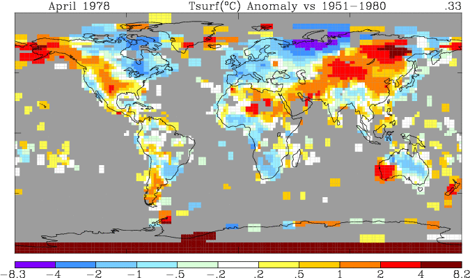
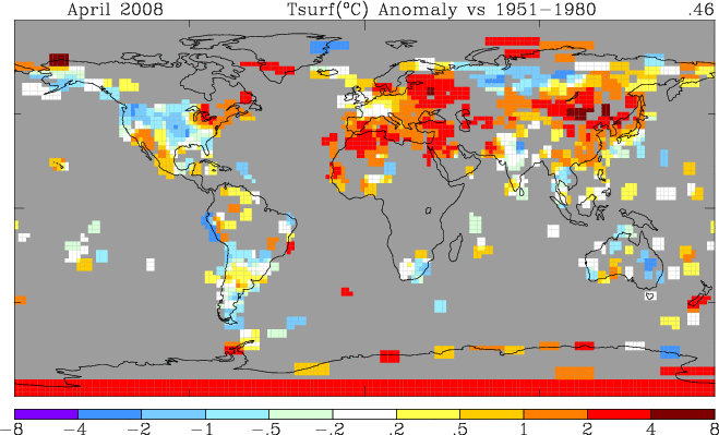
Here are two images showing the difference between GISS global coverage in 1978 and 2008:
Click for a larger image
Click for a larger image
There is a tremendous amount of station dropout in 30 years. Dropout is worst in the high northern latitudes, most all of Canada, and about half of Africa. Of particular note is the red band at the southernmost latitude, which “seems” to indicate a continuous coverage there. Of course we know that is not true, given the paucity of stations in the Antarctic interior. Read more here.
By contrast, while it doesn’t hit both poles (neither does GISS) UAH has much broader global coverage as seen below. Could this be part of the explanation for the divergence between GISS and satellite data? What do the readers think?
![[Image]](http://discover.itsc.uah.edu/amsutemps/browse/AMSU_A_15.latest.a_04.png)
Click for larger image
![[Image]](http://discover.itsc.uah.edu/amsutemps/browse/AMSU_A_15.latest.d_04.png)
Click for larger image
How different would the GISS graph appear, if it showed a -3.6C/century cooling trend over the last six years? For reference, the steep GISS warming trend from 1980 to 2002 was about 0.4 degrees.
Thanks to wattsupwiththat


The global temperature trend depends on when you choose the starting year and the interval of time that follow the trend.
ReplyDeletehttp://sansteknologi.blogspot.com/