sponsored links


Showing posts with label arctic sea ice. Show all posts

Monday, September 14, 2009

Polar bears 'face extinction in less than 70 years because of global warming'

A polar bear stands on the edge of the 'ice bridge'
Photo: NICK COBBING / GREENPEACE


Melting ice is causing their numbers to drop dramatically, they warn.


Others also at risk include ivory gulls, Pacific walruses, ringed and hooded seals and narwhals, small whales with long, spiral tusks.


One of the problems is that other animals are moving north, encroaching on their territory, spurred by increasing temperatures, pushing out native species.


The animals are also struggling with the loss of sea ice.


"The Arctic as we know it may soon be a thing of the past," said Eric Post, associate professor of biology at Penn State University, who led the latest study, publied in the journal Science.


"Recent projections suggest polar bears could be extinct within 70 years.


"But we think this could be a very conservative estimate. The outlook is very bleak for them and other creatures such as ringed seals.”


He added: "The rate at which sea ice is disappearing is accelerating and these creatures rely on it for shelter, hunting and breeding. If this goes, so do they.”


The international team analysed average temperature in the Arctic over the last 150 years and warn many animals that are dependent upon the stability and persistence of sea ice are faring especially badly.


Polar bears and ringed seals both give birth in lairs or caves under the snow and can lose many newborn pups when the lairs collapse in unusually early spring rains, triggered by climate change.


Among animals migrating further north are red foxes, which are driving out the smaller Arctic foxes.

Wednesday, September 9, 2009

Arctic Record Proves Global Warming is Caused by Man

factory-pollution

The Arctic’s geological record provides all the evidence we need that global warming is man’s doing, experts say. A closer look at the sediment timeline has shown that increased ice melt falls right in line with the birth of the Industrial Age, when those billowing clouds of greenhouse gases first started to flow from factory smokestacks.


From the LA Times:

For more than 2,000 years, a natural wobble in Earth’s axis has caused the Arctic region to move farther away from the sun during the region’s summer, reducing the amount of solar radiation it receives. The Arctic is now 600,000 miles farther from the sun than it was in AD 1, and temperatures there should have fallen a little more than 1 degree Fahrenheit since then.

Instead, the region has warmed 2.2 degrees since 1900 alone, and the decade from 1998 to 2008 was the warmest in two millenniums, according to a team headed by climatologist Darrell S. Kaufman of Northern Arizona University.

Not only was the last half-century the warmest of the last 2,000 years, “but it reversed the long-term, millennial-scale trend toward cooler temperatures,” Kaufman said.

The results seem to negate the primary argument of those who say the current warming of Earth is simply a natural variation, he said.

It’s not too difficult to understand the argument that people have against anthropomorphic global warming – that we, as humans, are simply too small and insignificant in the grand scheme of things to cause such changes in the earth and its natural balance. After all, nature is quite an amazing force.


But, to believe that we aren’t capable of causing global warming is to ignore the massive destruction we have unleashed upon this planet as we rose to the top of the food chain and began industrializing. We have changed the atmosphere. We have destroyed ecosystems and decimated much of the rainforest that would otherwise be helping to balance the greenhouse gases we’re pumping into the air.


It’s real, it’s happening, and we did it. Now we have to find a way to make up for it.


Link [LA Times]


Photo credit: Flickr user A6U571N

Sunday, September 6, 2009

Arctic Summers might be Warmest in 2000 Years

A millennia-long cycle of natural cooling in the Arctic, due to changes in the earth's orbit around the sun has been reversed due to increased levels of greenhouse gases in the atmosphere.


Sunset over the Arctic.

This reversal has supposedly raised Arctic summer temperatures to their highest levels for at least 2000 years, according to a report that was posted in the Journal Science.


The rise in temperature began around 1900 and accelerated after 1950.


Professor Darrell Kaufman, a climate scientist at Northern Arizona University and lead author of the study, along with his colleagues reconstructed a decade-by-decade record of the Arctic climate over the past 2,000 years by analyzing lake sediments, ice cores and tree rings. Computer simulations of changes in seasonal sunlight levels caused by the Earth's elliptical orbit and the shifting tilt of its axis verified the long-term cooling trend.


The scientists showed that summer temperatures in the Arctic fell by an average of 0.2C every thousand years, but that this cooling was swamped by human-induced warming in the 20th century, according to the article from the Guardian.
---------------------

Check out this link from the Daily Mail Online (UK). It shows a melting glacier that appears to take the form of a crying face. With today's photo imaging software, an image like this can certainly be doctored, but I doubt it in this case. If it is real, that is a pretty cool image. One of our regular commentators (Kipp) is a photography professional, I wonder what he thinks.

Thursday, September 3, 2009

Submarines and the Arctic Sea ice Record

A group of scientists and students, including Ron Kwok of NASA's Jet Propulsion Laboratory visited the Northwest Passage over this summer to run a check up on the health of the sea ice.


In particular, the scientists were looking at the thickness of the ice and trying to determine the longer term changes that have been going on.


Satellites have only monitored sea ice extent since 1973. NASA's Ice, Cloud, and land Elevation Satellite (ICESat) has been on the task since 2003, allowing researchers to estimate ice thickness as well, according to the NASA article.


In order to extend that record, the research team recently combined the high spatial coverage from satellites with a longer record from Cold War submarines to piece together a history of ice thickness that spans close to 50 years.


In total, declassified submarine data span nearly five decades--from 1958 to 200--and cover a study area of more than 1 million square miles, or close to 40 percent of the Arctic Ocean.


Their analysis shows that the Arctic Sea Ice thickness has declined 53% since a peak in 1980. Also, the current thinning of Arctic sea ice has actually been going on for quite some time.


A comparison of winter ice thickness in the Arctic. The top image is from 1988, while the bottom image is an average from 2003-2008 with the help of ICESat. Image courtesy of NASA.

"We need to understand the long-term trends, rather than the short-term trends that could be easily biased by short-term changes," Kwok said. "Long-term trends are more reliable indicators of how sea ice is changing with the global and regional climate."


That's why a long-term series of data was necessary. "Even decadal changes can be cyclical, but this decline for more than three decades does not appear to be cyclical," according to Drew Rothrock of the University of Washington.


"A fantastic change is happening on Earth -- it's truly one of the biggest changes in environmental conditions on Earth since the end of the ice age," said Tom Wagner, cryosphere program manager at NASA Headquarters.

Friday, June 5, 2009

Daily Arctic Sea Ice Images back Online

The daily Arctic sea ice images from the National Snow and Ice Data Center (NSIDC) were brought back online on Tuesday. The NSIDC completed the transition from the Defense Meteorological Satellite Program (DMSP) F13 satellite, to the DMSP F17 satellite, which will allow the NSIDC to continue their long-term record of sea ice extent.


Looking at the latest sea ice extent, it appears that there was a significant drop off during the month of May. At the start of the month, the sea ice extent was very close to the 1979-2000 average, but by the end of the month it was closer to the record minimum year of 2007. Time will tell where it ends up at the end of the melt season in September.


June 2, 2009

Here is that same graph going back one year to June 3, 2008.


Here is an image showing the sea ice concentration as of June 2, 2009 over the Arctic region. Image courtesy of the University of Bremen, Germany.

Let's go back one year and see what the sea ice concentration looked like on June 2, 2008

It appears that there are many more areas of lower sea ice concentration currently compared to last year, especially on the Canadian side of the Arctic.

Saturday, May 30, 2009

Arctic Sea Ice Trends over the Past 10 Years

Now that showed the Antarctic Sea Ice, it's time to check out the Arctic region.


The images below show the minimum sea ice extent during the month of September in 1999 and 2008 below it. They also show the Arctic sea ice maximum during the month of March in 1999 on the top right and 2009 below it.


Clearly, you can see that the greatest differences between the 1999/2000 and 2008/2009 season are during the sea ice minimum in September. You can also animate the images of all years since 1999 by clicking the play button on the Earth Observatory page.


The yellow outline on each image shows the median sea ice extent observed by satellite sensors in September and March from 1979 through 2000.


1999/2000

2008/2009

Since 1978, satellites have detected an overall decline in Arctic sea ice. The rate of decline steepened after the turn of the twenty-first century.


A key statement from the NASA article......


Cycles of natural variability such as the Arctic Oscillation are known to play a role in Arctic sea ice extent, but the sharp decline seen in this decade cannot be explained by natural variability alone. Natural variability and greenhouse gas emissions (and the resulting rise in global temperatures) likely worked together to melt greater amounts of Arctic sea ice.

------------

This time series is made from a combination of observations from the Special Sensor Microwave/Imagers (SSM/Is) flown on a series of Defense Meteorological Satellite Program missions and the Advanced Microwave Scanning Radiometer for EOS (AMSR-E), a Japanese-built sensor that flies on NASA’s Aqua satellite, according to the NASA Earth Observatory article.

Monday, May 18, 2009

As Glaciers Melt, Alaska Land Rising

Juneau, Alaska - Global warming conjures images of rising seas that threaten coastal areas. But in Juneau, as almost nowhere else in the world, climate change is having the opposite effect: As the glaciers here melt, the land is rising, causing the sea to retreat.

Morgan DeBoer, a property owner, opened a nine-hole golf course at the mouth of Glacier Bay in 1998, on land that was underwater when his family first settled here 50 years ago.


”The highest tides of the year would come into what is now my driving range area,” DeBoer said. Now, with the high tide line receding even farther, he is contemplating adding another nine holes. “It just keeps rising,” he said.


The geology is complex, but it boils down to this: Relieved of billions of tons of glacial weight, the land has risen much as a cushion regains its shape after someone gets up from a couch. The land is ascending so fast that the rising seas - a ubiquitous byproduct of global warming - cannot keep pace. As a result, the relative sea level is falling, at a rate “among the highest ever recorded,” according to a 2007 report by a panel of experts convened by Bruce Botelho, Juneau's mayor.


Greenland and a few other places have experienced similar effects from widespread glacial melting that began more than 200 years ago, geologists say. But, they say, the effects are more noticeable in and near Juneau, where most glaciers are retreating 30 feet a year or more.


As a result, the region faces unusual environmental challenges. As the sea level falls relative to the land, water tables fall, too, and streams and wetlands dry out. Land is emerging from the water to replace the lost wetlands, shifting property boundaries and causing people to argue about who owns the acreage and how it should be used. And meltwater carries the sediment scoured long ago by the glaciers to the coast, where it clouds the water and silts up once-navigable channels.


A few decades ago, large boats could sail regularly along Gastineau Channel between Downtown Juneau and Douglas Island, to Auke Bay, a port about 10 miles to the northwest. Today, much of the channel is exposed mudflat at low tide. “There is so much sediment coming in from the Mendenhall Glacier and the rivers - it has basically silted in,” said Bruce Molnia, a geologist at the U.S. Geological Survey who studies Alaskan glaciers.


Already, people can wade across the channel at low tide - or race across it, as they do in the Mendenhall Mud Run. At low tide, the navigation buoys rest on mud.


Eventually, as the land rises and the channel silts up, Douglas Island will be linked to the mainland by dry land, said Eran Hood, a hydrologist at the University of Alaska Southeast and an author of the 2007 report, “Climate Change: Predicted Impacts on Juneau.”


When that happens, Hood said, the Mendenhall Wetlands State Game Refuge, 4,000 acres of boggy habitat, will be lost. “That wetland will have nowhere else to go,” he said.


In some places along the coast, the change has been so rapid that kayakers whose charts are not up-to-the-minute can find themselves carrying their boats over shoals that are so high and dry they support grass or even small trees.


In and around Juneau, “you can walk around and see what was underwater is turning into grassland and eventually into forest,” Hood said.


The topographical changes have threatened crucial ecosystems and even locally vital species like salmon.


”The lifeblood of our region has been salmon species and their return - and what is the impact when they return and the streams are dry?” said Botelho, who was born and raised in Juneau. “The salmon is bound to our identity as a region, who we are.”


He said he did not think that any species were in imminent danger but added, “Anyone who is following climate change has to see that there are risks, perhaps great ones.”


Hood said many people in Juneau had hoped to maintain a waterway called Duck Creek as a salmon stream. But small streams like that “appear to be drying out,” he said. “There are a lot of people in town saying, “Let's just let it return to a greenway.”'


Relative to the sea, land here has risen as much as 10 feet in little more than 200 years, according to the 2007 report. As global warming accelerates, the land will continue to rise, perhaps 3 more feet by 2100, scientists say.


The rise is further fueled by the movement of the tectonic plates that form the earth's crust. As the Pacific plate pushes under the North American plate, Juneau and its hilly Tongass National Forest environs rise still more.


”When you combine tectonics and glacial readjustment, you get rates that are incomprehensible,” Molnia said.


In Gustavus, where DeBoer's property is, the land is rising almost 3 inches a year, Molnia said, making it “the fastest-rising place in North America.”


In addition to expanding the golf course, DeBoer is negotiating with the Nature Conservancy to preserve some of the newly emergent land. He can do both, he said, because the high tide line has pushed almost a mile out to sea since his family first homesteaded on the property.


Where the shoreline is relatively flat, “it doesn't take much uplift to make quite a bit of difference,” DeBoer said. Kristin White, a 28-year-old schoolteacher who grew up in Haines, a town north of here, is from another family in the area whose real estate grew as land rose. When her father tried to sell some property in Haines, she said, “he had to have it resurveyed.”


But for White, who has vivid memories of visiting the Mendenhall glacier as a child, the gain in acreage has been bittersweet. Seeing the glacier retreat, she said, is “as if you lived in the Smoky Mountains and you were used to seeing certain peaks - and they disappeared. It's just totally, totally sad.”

Tuesday, May 5, 2009

Mercury Levels In Arctic Seals May Be Linked To Global Warming


Researchers are reporting that high mercury levels in Arctic seals appear to be linked to vanishing sea ice caused by global warming. (Credit: NOAA)

Researchers in Canada are reporting for the first time that high mercury levels in certain Arctic seals appear to be linked to vanishing sea ice caused by global warming. Their study provides new insight into the impact of climate change on Arctic marine life.

Gary Stern and colleagues note in the new study that Canadian Arctic ringed seals, like many Arctic marine animals, have relatively high levels of mercury. However, researchers have never determined how these levels are linked to sea ice extent and the resulting composition of arctic cod and other prey containing mercury available to ringed seals.


The scientists analyzed the mercury content in muscle samples collected from ringed seals between 1973 and 2007. They then compared the levels to the length of the so-called "summer ice-free season," a warm period marked by vanishing sea ice in the seals' habitat. They found that the seals accumulated more mercury during both short (2 months) and long (5 months) ice-free seasons and postulate that this is related to the seals' food supplies.


Higher seal mercury concentrations may follow relatively short ice-free seasons due to consumption of older, more highly contaminated Arctic cod while relatively long ice-free seasons may promote higher pelagic productivity and thus increased survival and abundance of Arctic cod with the overall result of more fish consumption and greater exposure to mercury. Longer ice-free seasons resulting from a warming Arctic may therefore result in higher mercury levels in ringed seal populations as well as their predators (polar bears and humans).


Sunday, May 3, 2009

Mayday - May Day!

nsidc_extent_n_timeseries_050109

NSIDC Arctic Ice Extent Just a few pixels from “average”.


May 1st is May Day . “Mayday” is a universally understood distress call signifying that an aircraft or other vessel is headed on a collision trajectory. 2009 Arctic ice extent is on a collision trajectory with normal, which could be disastrous for AGW alarmists. ”May Day” is an international holiday celebrated on May 1. In the Soviet Union it celebrated the worker’s “liberation” from capitalism, though they hadn’t yet thought up “cap and trade” at that time.


I have more news to report about the ongoing mystery of why NSIDC shows Arctic ice extent much closer to the 1979-2000 average than NANSEN is to the 1979-2007 average. It should be the other way around.

http://eva.nersc.no/vhost/arctic-roos.org/doc/observations/images/ssmi1_ice_ext.png

NANSEN Arctic Ice Extent


Dr. Walt Meier at NSIDC has again graciously responded to further questions:

Dr. Meier:
It is possible that there could be inconsistency in the Nansen data. I’m not familiar with their processing. I am confident that our dataset is consistent. However, it may simply be due to the ice conditions. Most of the time, the differences between algorithm should be an offset - though this offset can vary over the course of the year (particularly summer vs. winter). However, there can inconsistencies in this depending on the character of the ice cover.

My suspicion is that much of this is due to the Bering. The ice in the Bering is very broken up and, basically, on its last legs. It could be that our algorithm is more sensitive in picking up the ice than the Nansen algorithm. Or it could be that our algorithm is overly sensitive and is not catching open water.
Remember that the threshold for ice extent is 15%. So if you have low concentration ice, even small differences in the algorithms can result in relatively large differences in extent. If Nansen consistently shows 5% less ice that NSIDC, when there is 90% ice, that makes no difference, but where there is ~15% ice, it can make a difference. From other imagery, it looks like there is a lot of area with concentrations in the ballbpark of 15%.


To which I responded back to Dr. Meier:

Me:
If it were due to Bering Strait ice, I would expect to see a convergence between the two data sets as the Bering ice melts. It looks to me like they are actually diverging over the last week or two though?

Any ideas from the readers?


UPDATE: Dr. Meier just responded, minutes after posting this article:

Dr. Meier:
It is the Bering Sea, not the Strait and as it begins to melt, with all the old, broken up, sparse ice, you see the divergence. As it melts out completely, I expect that we’ll see things go back to being more consistent.

Addendum from Anthony:


A question to Dr. Meier: When are we going to see a date/time stamp on the NSIDC imagery? NANSEN has one.


This NSIDC graphic above is one of the most widely displayed and quoted on the net today, yet it lacks this most basic feature found in many scientific images presented for public consumption.


I realize the curve itself is marked against the x axis, but it is not easy to determine an exact date. Science is exacting, it would seem prudent to add a date/time stamp. Otherwise, the appearance of exacting science presented to the public is one of sloppiness, IMHO.

wattsupwiththat

Sunday, February 22, 2009

Sea Ice Sensor Degradation Hits Cryosphere Today

You may recall that I posted about how the National Snow and Ice Data Center has an issue with the DMSP satellite sensor channel used to detect sea ice. Cryosphere Today is a few days behind in update compared to NSIDC, and here is what their imagery now looks like before and after:

cryosphere2day_021909-022009-small

Above: Arctic “Insta-melt” Click for a larger image


Here is the link to reproduce the image above.


Larger “holes” are likely to open up in the arctic sea in the next couple of days as the sensor further degrades.


Here is what CT has to say as a caveat for the side by side images:

February 17, 2009 - The SSMI sensor seems to be acting up and dropping data swaths from time to time in recent days. Missing swaths will appear on these images as a missing data in the southern latitudes. If this persists for more than a few weeks, we will start to fill in these missing data swaths with the ice concentration from the previous day. Note - these missing swaths do not affect the timeseries or any other plots on the Cryosphere Today as they are comprised of moving averages of at least three days.

No mention of the issue on CT’s main page though. They are still commenting on George Will. They seem a bit out of touch on the sensor issue.


Possibly related posts: (automatically generated)

Friday, February 20, 2009

NSIDC: satellite sea ice sensor has “catastrophic failure” - data faulty for the last 45 or more days

http://gbailey.staff.shef.ac.uk/researchoverview_images/dmsp.jpg
The DMSP satellite is still operating, but the SSM/I sensor is not


Regular readers will recall that on Feb 16th I blogged about this graph of arctic sea ice posted on the National Snow and Ice Data Center sea ice news page. The downward jump in the blue line was abrupt and puzzling.

nsidc_extent_timeseries_021509

Click for larger image


Today NSIDC announced they had discovered the reason why. The sensor on the Defense Meteorological Satellite Program (DMSP) satellite they use had degraded and now apparently failed to the point of being unusable. Compounding the bad news they discovered it had been in slow decline for almost two months, which caused a bias in the arctic sea ice data that underestimated the total sea ice by 500,000 square kilometers. This will likely affect the January NSIDC sea ice totals.

Map of sea ice from space, showing sea ice, continents, ocean
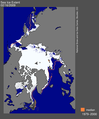
Figure 1. High-resolution image Daily Arctic sea ice extent map for February 15, 2009, showed areas of open water which should have appeared as sea ice. Sea Ice Index data. About the data. Please note that our daily sea ice images, derived from microwave measurements, may show spurious pixels in areas where sea ice may not be present. These artifacts are generally caused by coastline effects, or less commonly by severe weather. Scientists use masks to minimize the number of “noise” pixels, based on long-term extent patterns. Noise is largely eliminated in the process of generating monthly averages, our standard measurement for analyzing interannual trends. Data derived from Sea Ice Index data set.
—Credit: National Snow and Ice Data Center
Graph with months on x axis and extent on y axis
Figure 2.
High-resolution image
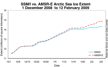
Daily total Arctic sea ice extent between 1 December 2008 and 12 February 2009 for Special Sensor Microwave/Imager SSM/I compared to the similar NASA Earth Observing System Advanced Microwave Scanning Radiometer (EOS AMSR-E) sensor. —Credit: National Snow and Ice Data Center


Dr. Walt Meier of NSIDC had planned to do a guest post here on WUWT, but this evening, with the magnitude of the problem looming, he’s asked to defer that post until later. I certainly can’t fault him for that. He’s got his hands full. Hopefully they have a contingency plan in place for loss of the sensor/space platform. I applaud NSIDC for recognizing the problem and posting a complete and detailed summary today. I’ve resposted it below in its entirety. Note that this won’t affect other ice monitoring programs that use the Advanced Microwave Scanning Radiometer (EOS AMSR-E) sensor, which is on an entirely different platform, the AQUA satellite.


UPDATE: 2/19 Walt Meier writes with a clarification: “One detail, though perhaps an important [one]. I realize that it is bit confusing, but it is just one channel of the sensor that has issues. And it isn’t so much that it “failed”, but that quality degraded to the point the sea ice algorithm - the process to convert the raw data into sea ice concentration/extent - failed on Monday.” - Anthony


From NSIDC Sea Ice News:


As some of our readers have already noticed, there was a significant problem with the daily sea ice data images on February 16. The problem arose from a malfunction of the satellite sensor we use for our daily sea ice products. Upon further investigation, we discovered that starting around early January, an error known as sensor drift caused a slowly growing underestimation of Arctic sea ice extent. The underestimation reached approximately 500,000 square kilometers (193,000 square miles) by mid-February. Sensor drift, although infrequent, does occasionally occur and it is one of the things that we account for during quality control measures prior to archiving the data. See below for more details.


We have removed the most recent data and are investigating alternative data sources that will provide correct results. It is not clear when we will have data back online, but we are working to resolve the issue as quickly as possible.


Where does NSIDC get its data?


NSIDC gets sea ice information by applying algorithms to data from a series of Special Sensor Microwave/Imager (SSM/I) sensors on Defense Meteorological Satellite Program (DMSP) satellites. These satellites are operated by the U.S. Department of Defense. Their primary mission is support of U.S. military operations; the data weren’t originally intended for general science use.


The daily updates in Arctic Sea Ice News & Analysis rely on rapid acquisition and processing of the SSM/I data. Because the acquisition and processing are done in near-real time, we publish the daily data essentially as is. The data are then archived and later subjected to very strict quality control. We perform quality control measures in coordination with scientists at the NASA Goddard Space Flight Center, which can take up to a year. High-quality archives from SSM/I, combined with data from the earlier Scanning Multi-channel Microwave Radiometer (SMMR) data stream (1979–1987) provide a consistent record of sea ice conditions now spanning 30 years.


Data error sources
As discussed above, near-real-time products do not undergo the same level of quality control as the final archived products, which are used in scientific research published in peer-reviewed journals. However, the SSM/I sensors have proven themselves to be generally quite stable. Thus, it is reasonable to use the near-real-time products for displaying evolving ice conditions, with the caveat that errors may nevertheless occur. Sometimes errors are dramatic and obvious. Other errors, such as the recent sensor drift, may be subtler and not immediately apparent. We caution users of the near-real-time products that any conclusions from such data must be preliminary. We believe that the potential problems are outweighed by the scientific value of providing timely assessments of current Arctic sea ice conditions, as long as they are presented with appropriate caveats, which we try to do.


For several years, we used the SSM/I sensor on the DMSP F13 satellite. Last year, F13 started showing large amounts of missing data. The sensor was almost 13 years old, and no longer provided complete daily data to allow us to track total daily sea ice extent. As a result, we switched to the DMSP F15 sensor for our near-real-time analysis. For more information on the switch, see “Note on satellite update and intercalibration,” in our June 3, 2008 post.


On February 16, 2009, as emails came in from puzzled readers, it became clear that there was a significant problem—sea-ice-covered regions were showing up as open ocean. The problem stemmed from a failure of the sea ice algorithm caused by degradation of one of the DMSP F15 sensor channels. Upon further investigation, we found that data quality had begun to degrade over the month preceding the catastrophic failure. As a result, our processes underestimated total sea ice extent for the affected period. Based on comparisons with sea ice extent derived from the NASA Earth Observing System Advanced Microwave Scanning Radiometer (EOS AMSR-E) sensor, this underestimation grew from a negligible amount in early January to about 500,000 square kilometers (193,000 square miles) by mid-February (Figure 2). While dramatic, the underestimated values were not outside of expected variability until Monday, February 16. Although we believe that data prior to early January are reliable, we will conduct a full quality check in the coming days.


Sensor drift is a perfect but unfortunate example of the problems encountered in near-real-time analysis. We stress, however, that this error in no way changes the scientific conclusions about the long-term decline of Arctic sea ice, which is based on the the consistent, quality-controlled data archive discussed above.


We are actively investigating how to address the problem. Since we are not receiving good DMSP SSM/I data at the present time, we have temporarily discontinued daily updates. We will restart the data stream as soon as possible.


Some people might ask why we don’t simply switch to the EOS AMSR-E sensor. AMSR-E is a newer and more accurate passive microwave sensor. However, we do not use AMSR-E data in our analysis because it is not consistent with our historical data. Thus, while AMSR-E gives us greater accuracy and more confidence on current sea ice conditions, it actually provides less accuracy on the long-term changes over the past thirty years. There is a balance between being as accurate as possible at any given moment and being as consistent as possible through long time periods. Our main scientific focus is on the long-term changes in Arctic sea ice. With that in mind, we have chosen to continue using the SSM/I sensor, which provides the longest record of Arctic sea ice extent.


For more information on the NSIDC sea ice data, see the following resources on the NSIDC Web site:

Wednesday, February 4, 2009

Arctic Sea Ice Increases at Record Rate

Guest Post by Jeff Id on February 3, 2009

Something I’ve been interested in for the last several months is sea ice data. What makes it interesting is that as I understand it, models demonstrate the poles should be most sensitive to global warming leading the planet temp, especially in the Arctic. Recently I have been able to process the monthly and daily gridded arctic data as provided by NSIDC. The daily values allow a better analysis of trend than can be provided by the monthly data.


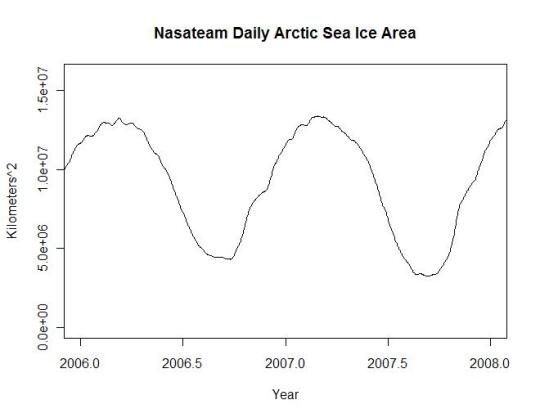
If you’re like me you recall the claims of fastest melt rate ever were made about 2007 , I fully believed them, because the graphs showed a much more negative value than in the previous 30 years as shown in Figure 1 below.

06-07-ice-area1

Click for larger image


This effort was originally intended to investigate how bad the melt rate was in comparison to the natural variation, I didn’t get that far yet. Accessing and processing the gridded data was critical to the analysis, so I spent the time reading the literature and writing code. Having full access to the NSIDC data allows some interesting analysis, they do an excellent job on their site.


There are two primary algorithms used for processing ice data NasaTeam and Bootstrap. The descriptions of the data state the difference between the two is very small and the sets are interchangeable except that bootstrap is recommended for trend analysis in research publications. Bootstrap is only provided in monthly data format while NasaTeam is provided in both monthly and daily provided you’re willing to download over 1G of data, write code to process it, refit the land and missing data mask and sum the results. I am. Also, NasaTeam provides a near real time version of the polar ice data which has a different land mask and hasn’t been processed for missing data. This data isn’t as clean but I wanted to use it. I applied the same land mask as the rest of the series to insure that there was a consistent baseline for trend analysis. The missing data from Jan 2008 onward created noise in the series which I simply filtered out using a 7 day sliding window filter.


The mask looks like this Figure 2

nasateam-arctic-ice-mask


The brown is land, black edges on land are coastline and light blue is the satellite data not measured. This mask is applied consistently through the entire data series. There was some question about masking on one of my other posts at WUWT where visually the land area seemed to change size, in the case of the NSIDC data they apply masks consistently except for the satellite hole and the near real time data.


The NasaTeam version of the arctic ice data looks like the plot below for 2009 (note the small size of the satellite data hole). This graph was created in R using the actual Nasa Team masks and data. I used the worst case land and polar masks to adjust the entire dataset to eliminate problems with consistency. Figure 3

nasateam-arctic-ice-feb-2009


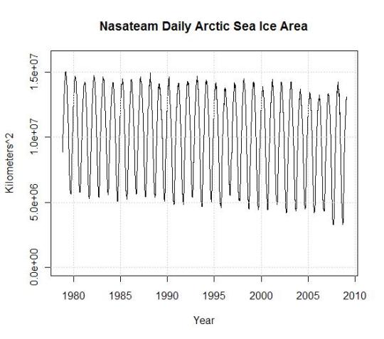
Of course it’s an interesting picture, but what I wanted to know when I started this post was how bad was the worst melt rate in history and what is the actual melt area. In the plot below the arctic is losing sea ice at a rate of only 56K km^2/year. Of course sea ice area went up in the Antarctic during the same time frame though. Note the strong recovery in 08 of Figures 1 and 4, which actually exceeds values of most of the record, matching data back to 1980. Much of this is first year ice so the melt in 08 was expected to be a new record.

30-yr-ice-area1

Click for larger image


If you recall, in 2007 and 08 we were treated to headlines like this, which most of us accepted with a shrug.

Scientists warn Arctic sea ice is melting at its fastest rate since records began


NASA data show Arctic saw fastest sea ice melt in August 2008


Arctic Just Witnessed Fastest August Ice Retreat in History


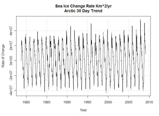
I processed and analyzed the NasaTeam land area and missing data masks spending hours understanding different variances they list on their own website. After nearly everything I could find (except satellite transitions errors) was corrected (a different post) and corrections for variance in the measured pixel size, the final result in 30 day trends of arctic sea ice looks like the graph below (Figure 5). This graph is a derivative of the ice area plot. The maximum peaks and valleys represent the maximum rates of change in 30 day periods through the ice record.

meltrate

Click for larger image


Looking at this plot of the 30 day slopes of actual NASA gridded data, the maximum ice melt rate occurs in 1999 and in 2004 not in 2007. Surprisingly the maximum ice growth rates occur in 2007 and 2008, I don’t remember those headlines for some reason. Don’t forget when looking at the 2008 - 09 peak, the data is preliminary and hasn’t been through the same processing as the other data. From looking at the unprocessed data I doubt it will change much.


Certainly the 30 year arctic trend in ice area is downward, even the most committed global warming scientist has to admit this happens regularly in climate along with regular 30 year uptrends. The questions are, did we cause it or not, and was CO2 the instigating factor. The rapid recovery of ice levels has to have some meaning regarding the severity of the problem. This goes directly in the face of accelerated global warming and the doom and gloom scenarios promoted by our politicians and polyscienticians.


Why are my conclusions different from the news reported records? I think it’s likely due to the fact that the scientists used the monthly data which is processed using a weighted filter of the daily data that incorporates a longer time frame than a single month. This means their use of the monthly data to establish a monthly trend was in error and the real record down trends were actually set in 1999, 2003 and 1984. While the record uptrends were in 2007, 2008 and 1996.

Sunday, January 25, 2009

A Brief Exegesis on Arctic Sea Ice

Arctic sea ice reaches 2008 minimum


In a comment on yesterday's post Carbon Emissions Curbs in Time for Copenhagen?, where some discussion ensued in the comments on carbon taxes vs. carbon cap-and-trade, reader Ted Clayton wrote,

Going for a Carbon Tax not only stiffs the President, but can be expected to harden public attitudes which already show little interest in the Anthropogenic Global Warming hypothesis. The best test of this hypothesis will come this summer, as we watch the Arctic Ocean icepack to see if it continues rebuilding. [[Emphasis mine.]]

This is a good opportunity to talk about what the overall trends in Arctic sea ice tell us about the state of the climate.


The quick hit: Polar sea ice is decreasing -- faster than expert scientists expected. The extent of Arctic summer sea ice hit a record low in 2007, the lowest since satellite measurements began in 1979. 2008 saw the second-lowest extent on record. Since the Arctic is more sensitive to changes in the climate than other environments on the globe, the melt of the Arctic is probably an early indicator of growing climate instability.


In the summer, Arctic ice melts, and recedes. In the winter, it forms and advances. What happens over the course of a year in terms of how much melting and freezing occur, or a couple years, is much less significant as an indication of what's going on with the climate, than the trends over longer periods of time.


Remember -- natural variation is occurring at the same time human-propelled global warming is destabilizing the climate. Interpreting trends over time is a question of signal to noise: The longer the period of time we look at, the more "noise" filters out -- in this case natural shifts in the climate system, such as El Nino/La Nina years -- and the stronger the signal that emerges.


What's emerged is that over the past 30 years,the extent of Arctic ice has decreased about 4.2 percent per decade, according to research cited by the National Snow and Ice Data Center. Below is the NSIDC's chart showing the overall trend -- that polar sea ice is decreasing at a fast rate -- since 1979, the year satellite measurements began. The gray line charts the average extent of Arctic sea ice during the summer melt from 1979 to 2000. The dark blue line shows the melt in the summer of 2008, and the light blue line shows the extent during the summer melt in 2007, when summer sea ice hit a record low:

September polar ice, 1979-2008

Per the NSIDC: "Extent comparisons: This graph compares 5-day running means for Arctic sea ice extent (area of ocean with ice concentration of at least 15 percent) for the long-term mean (1979-2000), the record low (2007) and the extent for 2008. Although Arctic sea ice retreated more slowly in June and July 2008 than it had the previous year, it experienced a record loss in August 2008." [[Emphasis mine.]]


In September of 2007, the extent of Arctic sea ice was 4.67 million square kilometers, the lowest on record -- 39.2 percent below the 1979-2000 average. In September of 2008, the extent was 4.67 million sq. km., "only 9 percent above 2007, despite cooler summer conditions," per the NSIDC.


Four of the past eight years have seen record-breaking loss of Arctic sea ice. Prior to 2007 and 2008's melts, the record lows were in 2002 (5.96 billion sq. km., a 15.3 percent drop from the 1979-2000 average) and 2005 (5.57 billion sq. km., 20.9 percent below the 1979-2000 average).


Sea ice thickness, has also decreased substantially over the past half-century or so, by about 1.3 meters between the 1950s and the 1990s, below shown by data on sea ice draft (the amount of ice below the water's surface):

Decrease in Arctic sea ice draft, 1958 to 1997.

Per the NSIDC: "Mean sea ice draft: Decrease in Arctic Sea Ice Draft for 1958 to 1997. Graph derived from Rothrock et al. 1999."


This 2003 article at the NASA Earth Observatory web site has a good overview of how overall warming of temperatures at the Arctic is accelerating.


Image: "This map shows the extent of sea ice on September 17, 2008, measured by the Advanced Microwave Scanning Radiometer (AMSR-E) on NASA’s Aqua satellite. Percent ice coverage is in shades of light blue to white. The gray line traces the boundary of the area normally covered by ice at the summer minimum based on data from 1979-2000. The line represents the median minimum ice extent; to qualify as "normally ice covered" an area has to meet the center’s criteria of at least 15 percent ice cover in at least half of the years in the record. The extent on September 17 was clearly much smaller than normal. Although this is not the first year the Northwest Passage has been navigable, it is the first year on record that both the Northwest Passage and the Northern Sea Route, on the opposite side of the Arctic, were both open." Source: NASA Earth Observatory

sponsored links


Dewa Project Dewa Project Dewa Project